Modals
Info: The modal sizes are defined by Bootstrap. The UI Bootstrap 4 (UIB) modal is to be utilized in conjunction with the template below. Be sure to pass the class 'modal-dialog-centered' so the modal is vertically centered on the page.
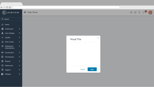
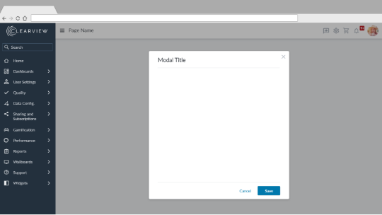
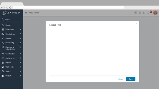
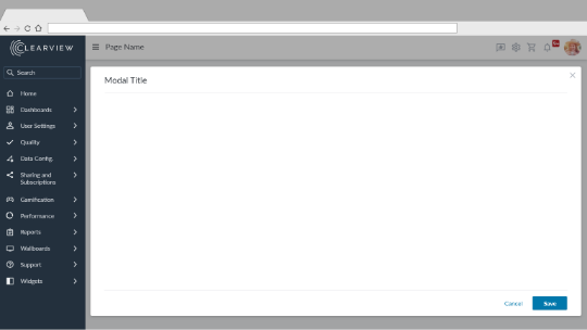
Modal Sizes
Modal Template
<div class="modal-header">
    <h7 class="modal-title d-flex justify-content-between">Modal Header</h7>
    <button type="button" class="modal-close icon-btn fill-valyrianSteel fill-hover-whaleTail" ng-click="">
        <svg class="icon-16">
            <use href="../App_Themes/clearview-default/icons/utility/close.svg#close"></use>
        </svg>
    </button>
</div>
<div class="modal-body">
    This is the modal's content.
</div>
<div class="modal-footer">
    <button type="button" class="btn btn-text mr-2" ng-click="">Cancel</button>
    <button type="button" class="btn btn-primary" ng-click="">Save</button>
</div>