Layout
Page layouts encourage consistency throughout the site by using uniform elements and spacing.
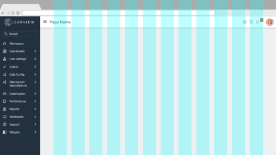
Responsive Grid
A grid is a system of rows and columns that provide structure and consistency to content. Designing and developing with a grid allows our product to be responsive from a mobile level all the way up to large screen monitors. We use a 12 column Bootstrap based layout grid.

Responsive Breakpoints
Since our product gets used on many different screen sizes, we want our product to be responsive to every kind of screen size, from large screens down to mobile. We use media queries to create sensible breakpoints for layouts and interfaces. These breakpoints are mostly based on minimum viewport widths and allow us to scale up elements as the viewport changes.

8px Baseline Grid
While a layout grid allows for overall responsiveness of a site, a baseline grid ensures consistency between individual components. This is a fixed grid for things that you don't want to be responsive. For example, padding within buttons and input boxes, icon sizes, the heights of buttons, etc. Text does not perfectly conform to the 8px grid, and that's ok. For more info about why an 8px grid was chosen, check out this article: https://builttoadapt.io/intro-to-the-8-point-grid-system-d2573cde8632

Default Theme Styling
Our default theme has certain styles that are consistent across every page:
- Background color (of Main area) is #EEF0F2.
- The "meat" of the page goes in a white container (main content) with 4px rounded corners and a subtle drop shadow.
- Primary buttons on pages are at the top left.
